Monday, February 28, 2011

CONFIGURATION OF YOUR IMAGINATION VINTAGE BIRD BOX

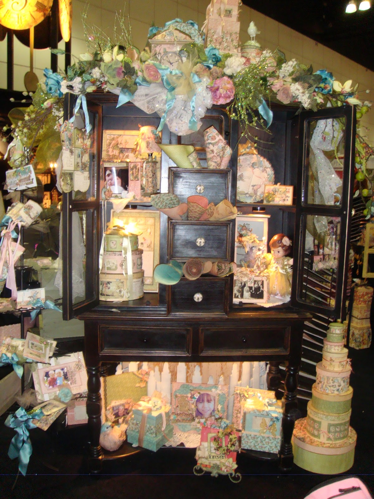
I am pleased and excited to announce that I will be teaching the "CONFIGURATION OF YOUR IMAGINATION VINTAGE BIRD BOX" at Scrapbook Generation in Springfield, Missouri on Saturday, March 19th from 10 to 3.  Call or go by Scrapbook Generation to enroll and get more information!  The Vintage Bird Box is on display at the store. 
In this class, you will learn how to transform a simple Tim Holtz Configuration Box into a darling piece of home décor that no one will believe you made! This class is full of techniques; teaching the "Tim Holtz way" of the constructing the box.  Then you learn how to create all of the darling elements that fill each of the compartments. From bird nests to a flickering little cabinet card light; YOU will create this very special work of art! You just need to bring your own lunch and a few class supplies.

Class Supply List:  craft sheet, scissors, pencil, glue - liquid, stick or multi medium matte and a foam brush, 1/4" double sided tape, hot glue gun and glue sticks, Glossy Accents, sanding block, Chestnut Roan and Black cats eye ink pads, Inkssentials Pen Nibs, Rock Candy Stickles, Distress Inks – Victorian Velvet, Scattered Straw, Broken China, Walnut Stain, Tumbled Glass (Just need applicators for Broken China and Walnut stain), Long nose pliers – I will have a pair for everyone to share, if you don’t have them.

More exciting news coming....  !!

Sunday, February 27, 2011

COMPENDIUM OF CURIOSITIES CHALLENGE #33 - ALTERED METAL ALCOHOL INKS

Hello again! A big THANK YOU to Linda Ledbetter of Studio L3 for hosting the Compendium of Curiosities Challenges!  These are wonderful because it gets your creative juices flowing and also teaches or reteaches Tim Holtz' wonderful techniques from his book Compendium of Curiosities.  If you don't have a copy of the book, it's well worth having.  The tips and techniques he shares in this book can be used in so many art forms.  Whether you're a scrapbooker, a card maker or a mixed media/altered artist, you can enhance your work with Tim's techniques!
Here is my challenge piece for Challenge Number 33 - Altered Metal Alcohol Inks.
While I can't tell you the technique of the alcohol inking part, I can tell you how I constructed the rest of this piece.  I used Tim's Hanging Sign die cut to cut the top two pieces.  Then I used Tim's Styled Labels to cut the bottom piece.  I added the keyhole Movers and Shapers die cut to the bottom piece.  I turned it upside down to resemble an exclamation point.  More about the bottom piece in a minute.
I cut all the dies out of black chipboard and then again with metal aluminum.  Then I die cut the letters "CREATE ART" from Tim's Vintage Market die cut strip.  I used cardstock and cut them twice and glue each letter together to make them a bit thicker.  Next I laid the letters out on the signs and glued them in place.  Then I glued the metal on top of the signs and the chipboard letters.  Then I took a paper stump and embossed around all of the letters; working in and around all the curved and indented areas.  Next, I alcohol inked the signs and the hanger.  The colors I used are as follows:
The Hanger - Ginger and Expresso
The "Create Sign" - Caramel and Stream
The "ART" Sign - Purple Twilight and Bottle
Next, I wanted to make the letters stand out so I used a QTip and rubbed it onto an Archival black ink pad.  Then I rubbed it over the letters to remove the alcohol ink and take the metal back to the silver that I started with.  Waterproof inks will remove alcohol ink!  Just keep rubbing off the alcohol ink with the waterproof ink and then wipe the letters with a paper towel when you are finished to polish up the letters!  That simple! 
Next I punched holes in the bottom of the "CREATE" sign and in the top of the "ART" sign.  I joined all of my pieces together with jump rings. 
To finish off this challenge piece, I added a portion of a Wendy Vecchi stamp behind the keyhole.  I stamped it on cardstock and colored it in with colored pencils.  I liked the face image peeking out from the keyhole.  Then I added some butterflies that I double stamped and stacked by gluing them on the "body".  I colored the top butterflies with colored pencils but used soft, muted colors so that they would accent and not compete with the more brilliant alcohol ink colors.  I pulled the top set of wings up a little to create a fluttering effect. 
Since this is a free hanging piece, I am sure I will find some place fun to let it hang!
Enjoy the rest of your weekend!  Take some time to play...it's SOUL FOOD!


Thursday, February 24, 2011

SIMON SAYS STAMP CHALLENGE - SHOW US STRIPES

Here is my entry for this week in SIMON SAYS STAMP CHALLENGE - SHOW US STRIPES.
I started out with an inexpensive wooden frame from Michaels.  I painted the sides and back with Raw Umber and covered the front with a stripe paper from Graphic 45's Communique collection.  Then I added the vintage lace to the upper edge and fashioned an "attic flower" out of the same lace.  I added some reddish pearls to the center and added a tie from a piece of left over lace.  I also added some vintage lace around the edge of the picture portion of the frame and behind the domino strip on the right side of the frame.  This was supposed to be another stripe on top of the stripes...but it pretty much got covered up with my tissue paper flowers and the saying I attached to that side.
I made a little "Public School Report Card" from an Oxford Impressions stamp from their "School Days" set.  LOVE their stamps! The "ABC", "123", the little boy inside the report card and the saying are all from the same set.
The book is made from stamping on cardstock, cutting it out and gluing it on to chipboard.  I then inked the image and the chipboard with Vintage Photo, Walnut Stain and Black Soot Distress Inks.  I attached the front of the book to the back of the book using black masking tape as a book binding. 
The tissue paper flowers are made from plain sepia colored tissue paper I found on clearance at Hobby Lobby.  I folded the tissue several times and used a scallop 1 7/8" punch to punch out the flower.  Next I stamped images onto the flowers using Black Soot Distress Ink and several collage type stamps.  I put about 12 of them together, folded them in half and punched a small hole in the center.  Then I opened the flowers out again and I could tie the flowers together by running a thread through the two holes and tying it together in the back of the flower.  I ran a little ribbon throughout the flowers for that extra little interest and hot glued everything into place. 
Finally, I cut two more dominoes out of the Graphic 45 paper, attached them to black chipboard and put some Glossy Accents on the cream dots on the dominoes.  When they were dry, I glued them into place.  Now I have a new little vintage frame...thanks to Simon Say Stamp Challenge!!
Take time to play!! It's SOUL FOOD!!


MY BLOG WAS TAGGED AND RECEIVED AN AWARD !!

My blog was tagged and received an award . . .

I'm so honored.

Nancy Wethington from Art From The Heart sent this to me!

Blog_award
The Liebster Award.
I am trying to find out who originated this blog award. Although it keeps getting passed down from one blog to another, the origin escapes me.

As a recipient, I can now award 3 - 5 blogs to *pass it forward*.  So, I chose these four wonderful ladies and their amazing work!  They inspire me every time I look at their blogs...so talented, creative and willing to share their beautiful work!

**  Wendy Southin - DRAGONFLY DREAMS
**  Netty - NETTY'S CRAFTINGS
** Lori - I BEEN THINKIN'....'BOUT INKIN'....
** Nancy Maxwell - SUGAR LUMP STUDIOS

Time to *pay it forward* girls!
Once you get this award please pass it on to your favorite blogs (3 to 5 blogs only please).
Hope you visit their blogs and enjoy their beautiful creations!
Have a great day!!!!


Wednesday, February 23, 2011

WELCOME KATIE LYNN !

I don't usually post a lot of personal stuff on my blog because:
 A)  I don't think I'm all that fascinating and
  B)  I'm not always sure I have something "profound" to say.  But, there are those moments in life that just need to be shared. 
Meet my new granddaugther:  Katie Lynn.
This absolutely precious little bundle of joy was born on Monday morning.  She joins her big brother, or as he calls himself, "the big brudda" Cooper who is 3 1/2.  They are the children of my son and his wife. 
Our daughter and her husband have blessed us with two identical twin grandsons, Caden and Cameron, who are 31 month old. 
God has so richly blessed our lives with our four little miracles: three adorable little boys and now, our beautiful little lady.  I never cease to be amazed at how, with each new life, the love in your heart grows and grows.  I wonder how can anyone possibly have more love to give...but you just DO!

Saturday, February 19, 2011

GINGERSNAP CHALLENGE - COFFEE AND CREAM

 I am entering this vintage little spool doll in the Gingersnap Challenge for this week:  Coffee and Cream.  The only prerequisite for this week's challenge is that you had to use the coffee and cream color palette as the main colors.  I also added some black because I think black is a great accent color with browns.  I love anything vintage and, in my opinion, these colors together scream "vintage".
The spool doll is made from an old spool of thread.  The face is of a vintage lady that I found online and sized to be the correct size.  I added some Vintage Photo and Spun Sugar Distress Inks to colorize her face a little.  Her arms are from some old vintage paper doll patterns I have.  I made a pattern for her "body" so that it would be the right size. For the bodice of her dress, I folded a small cream round doily in half, added a bit of Vintage Photo Distress to it and it became the 'yolk" and cap sleeves of her dress.  I then added a piece of vintage lace around her neck as a collar and a small old button as a "broach". I finished off her dress with some tulle as a proper skirt for this vintage lass and a bit of sparkly gold ribbon to hide where the paper part and the spool part of the doll connect.   
Behind her head, are varying sizes of scallop die cuts.  The larger is black with gold Stickle accents.  The smaller is cream.  I added a piece of vintage ivory lace, vintage buttons and some cream and black feathers to make her a "fancy" her hair piece.
I also love adding metal to my pieces when appropriate.  So, I added an antique copper dragonfly to one of the sashes of her gold bow and some antique copperish metal hearts on a wire that my vintage lady is holding. 

Thursday, February 17, 2011

COMPENDIUM OF CURIOSITIES CHALLENGE #32 - INKING AND STAMPING MASKS

The Compendium of Curiosities Challenge this week is INKING AND STAMPING MASKS.  I guess my tag reflects my thoughts today....TIME IS FLYING!
I can't believe it is already almost the end of FEBRUARY!  I can't believe it's 2011!  I can't believe it's almost 3:30 and I have not even THOUGHT about starting dinner!  (smile)  My family is all getting together for dinner tonight...and I'm cooking it! Oops...I better quite playing and start thinking about doing something "responsible"!
We can't divulge how to do the technique, but I can tell you how I did the rest of the tag.  I started by stamping the weathered clock stamp onto a blank tag.  Then I did the technique of inking and masking.  The background color of the tag is Broken China Distress Ink.  I used a large harlequin pattern as my background behind the clock face.  I stamped my wings with Stazon Timber Brown on a separate piece of cardstock and sprinkled Queens Gold and Copper embossing powders over the stamped image.  I heat embossed the wings.  I am a little disappointed that not more of the fine detal of the winds came through.  Note to self:  next time, use a super fine detail embossing powder! Then I inked around the edges of wings with black.
 I inked around the edge of the tag with Walnut Stain Distress Ink and hit just the very edges of the tag with a black cats eye ink pad.  Next I rubbed Timber Brown ink over some ivory cardstock and then sprinkled it with the embossing powder mix.  I heat set it.  Then I die cut "Time Flies" using Tim Holtz' "Vintage Market" letters.  I inked around the edges of the letters with a black cats eye ink pad and glued them in place.
Next I heat embossed the flying birds (another Tim Holtz stamp) behind the weathered clock face using the same embossing powder mix.  I also tapped around some of the edges of the tag with embossing ink, sprinkled it with the embossing powder and heat set some embossing powder randomly around the edges of the tag.
I trimmed the wings to fit my clock and glued them into place.  I used Black Diamond Stickles to accentuate part of the weathered clock face and let it dry.  Finally, I added matching ribbon to the tag and a piece of antique brass chain for added interest.  I added a lock and key to the chain.  The lock and key were silver so I tapped them with Ginger Alcohol Ink to change the color to more of a copperish tone.
Make time to PLAY...it's SOUL FOOD!  Speaking of food...I need to start fixing supper! 

Monday, February 14, 2011

SIMON SAYS STAMP CHALLENGE - SHOW US A TAG

Happy Valentine's Day Everybody!

I am putting the cart before the horse with this post, but since the SIMON SAYS STAMP CHALLENGE is SHOW US A TAG, I'll post a picture of my tags first and then I will tell the story behind them.
This is the front side of the tags.

This is the back side of the tags.

Now for the story behind them....

I saw a folder book made from a manila folder in the current issue of Cloth Paper Scissors and it fascinated me...so I decided to try my hand at making one. I had no idea where I was going with it.  I just wanted to try it!  I pulled out various papers I had laying around and before I knew it, I was sewing the book together.  Here is a picture of the finished book without any tags in it.
I found my stash of some older Tim Holtz' 9x9 Distressables papers and used them throughout almost all of the book.  I stamped vintage buttons on some Sticky Back Canvas and used it as the outer "spine" of book as well as an embellishment on one of the interior pockets.  I sewed the book together and stamped "CREATE" and "TIM" on the outer exposed edges of the manila folder.  It's a cool book but it needed tags!
Since I'd used those Tim Holtz papers that I dearly love to create the book, I decided the tags needed to stay with the Tim Holtz theme.  Almost all of the sayings and stamps are from his stamp collections. 
I used all sorts of techniques in creating the tags; fantasy film for the wings of the little girl sitting on the clock, rusted enamel technique over the saying on the "let yourself fly" tag, other different heat embossing techniques, stamping right on the tag or stamping on cardstock and then popping the image on a tag.  I stamped a "negative strip" on vellum and took a couple of images off of Tim's Photographic stamp to use as the heads inside of the negative strip. It was still hard to see the images so I put cardstock behind it.  Problem solved.  I had neve rdone that before, but I liked the result.  I couldn't go too crazy with embellishments because the book has to be able to half way close. (smile)
Here is a picture of the completed book with the tags slipped into their pockets.
This was my first attempt at a project like this and it won't be my last!  This was so much fun to do and I love how it all came together.  I had no idea which tag was going where as I worked on them.  As Tim always says, "don't over think it".  So, that is what I tried to do.
Have a great week everybody!  Take some time to play...IT'S SOUL FOOD!

Wednesday, February 9, 2011

SIMON SAYS CHALLENGE - EMBOSSING

Simon Says "Show Embossing!"  So, I'm going to show some embossing! This is a tag I created using several different embossing techniques. First I started with a tag that I distressed with Wild Honey and Broken China Distress Inks. Next, I rubbed Walnut Stain Distress Ink over the interior of Tim Holtz' Patchwork Texture Fade folder so that all of the raised areas would be colorized with Walnut Stain. Then I slipped the colored tag into place and dry embossed it.
Next, I ran an embossing pen over the raised areas and sprinkled them with a mixture of Queens Gold and Copper embossing powder.  Then I heat set the powder. I love the result! The patina looking tag is contrasted by those beautiful dark brown areas that are then highlighted with the goldish copper embossing powder! So, dry embossing followed by heat embossing layered on top of the dry embossing.
Next, I lightly rubbed the embossing ink pad on the edges of the tag, sprinkled more of the mixed embossing powder on the edges and heat set them. I like the randomness of the embossed powder. It looks like it is flaking off in some areas.
I love all of the images on this patchwork texture fade. The King of Clubs symbol, the big crown, the number 13 and the old vintage clock face specifically caught my eye. The King of Clubs image made me think of the playing card stamp I used on this tag.
I heat embossed the design on the card using Antiquities "Rust" embossing powder. I colored in the "king" in the center of the card using colored pencils. I distressed the edges of the card with Tim Holtz' distress tool and inked the card with Vintage Photo, Walnut Stain and a little Black Soot Distress Inks for that aged look.  Finally, I repeated the technique of lightly rubbing the embossing ink pad randomly around the edges of the card, sprinkled them with the goldish-copper mixed embossing powder and heat set it. I raised the card off of the tag using pop dots.
As a finishing touch, I heat embossed "LUCKY" on a scrap of a Graphic 45 paper and mounted it again onto a piece of kraft paper. I distressed the edges of the kraft paper and inked them with Black Soot. I attached two dark keys with small ball chains and popped that element into place above the playing card.
 Finally, I added two earring pieces I found at a flea market to either side of "LUCKY".The earrings had no embellishments on them, only a bare metal cavity. So, I added the "bling" to the center of the earrings. I don't think they look like earrings anymore!  
I named this tag "The King Of Diamonds".

Tuesday, February 8, 2011

COMPENDIUM OF CURIOUSITIES CHALLENGE #31 - RUSTED ENAMEL

I can't believe it's already Challenge #31! This one was ALOT of fun to do!  I won't give away the technique of doing the Rusted Enamel.  You'll have to check out Tim Holtz' Compendium Of Curiousities book, page number 41 to figure that one out! But, I CAN tell you how I did the rest of the tag.
I used Tumbled Glass, Frayed Burlap and Walnut Stain Distress Inks to distress the tag. The stamps I've used on this tag are primarily from an Oxford Impressions set called "Steampunk Works". I LOVE the detail of these stamps! Check out the bird...his wings are measuring tapes! So cute!

I stamped a couple of designs right onto the tag after I did the Rusted Enamel technique.  The rest of the images were stamped onto an old manilla folder using black Archival ink. Then I inked them with Vintage Photo Distress Ink for that real vintage look. I cut out the center of the round frame style of stamp so that I could add a vintage picture. I chose a mustached man from Tim Holtz' Distressables and DooDads-Wings and Things #2. But, before I glued the man in place, I used a piece of plastic packaging from one of my MANY Tim products to make a little "glass" cover over the picture. It's cool when you hold the tag in the light because you can see the reflection of the "glass". I made my own STEAMPUNK "metal" tab out of the same manilla folder. I heat embossed it with copper embossing powder and then lightly distressed it with Black Soot Distress Ink. I used that same technique on the wind up key in the bird's back. Before putting STEAMPUNK in place, I put a piece of plastic over the opening, just like I had done on the vintage picture.  Finally, I stamped one of Tim Holtz' blank tickets from his 100th Collections-Odds and Ends stamp set. I heat embossed ART with copper embossing powder in the center of the ticket and stuck it into place with one of Tim Holtz' Memo Pins from his Ideaology line.
I pop dotted the mustached man's image and the steampunk bird for more of a 3D effect. And what's a steampunk tag without metal embellishments? I added a few of Tim Holtz' wonderful metal pieces from his Foliage and Sprockets and Gears Ideaology line. A little ball chain adds extra interest as it goes in and out of some of the elements on the tag. Finally, I colorized and distressed some Hug Snug seam tape and attached it to the top of the tag.  
It's COLD outside and more snow is on the way! What a good time to stay indoors and PLAY! Take some time to explore your imagination and see what you can conjure up! You may really surprise youself! 

Thursday, February 3, 2011

SIMON SAYS CHALLENGE - SHOW SOME LOVE

The Simon Says Challenge this week is Show Some Love.  Well, here is my LOVE.

These wooden blocks are about 3 1/2". I painted them with either a red or antique white base. Then I sanded them just a little bit and touched them up wtih Vintage Photo Distress Ink to give them more of a vintage feel.The front sides of the blocks display "LOVE". I built this side up by using a red foil or white paper heart doilie as the base. Then I layered hearts I cut out from a vintage-ish Valentine paper I had. The letters are 2" chipboard letters from the Paper Studio. I heat embossed them with red tinsel embossing powder and placed them on top of the hearts in the center of each block.

All other sides of the blocks are decorated with retro Valentines. Are they not just so fun? Just looking at these reminds me of the Valentine parties we used to have in elementary school.  We would decorate shoe boxes and cut a slit in the top of them so everyone could drop their Valentines in our boxes. I actually think I remember some of these!
These are either Valentines that I have or images that I found online and saved. I sized them to fit my blocks, printed and cut them out. Then I glued them onto the painted sides and let them dry. Next, I covered each side with Rock Candy Stickles to really make the colors on the Valentines "pop" and also to give them that crystally vintage finish that Rock Candy Stickles provides. Finally, I embellished each side with all sorts of different trims, bling, mini red roses, and other fun items to fit the theme of that Valentine. For example, the cowboy Valentine is encircled by "rope". The shaving Valentine has "lather" made from a liquid applique pen that was heated to make the bubbles "pop". Then I sprinkled some small crystal glitter on the lather to make is sparkle. I made the popcorn "pop" on the popcorn Valentine by using Picket Fence Stickles and kept mounding it on until it created its own realistic looking popcorn. I also did the same effect around the Valentine and added some glitter to the Picket Fence Stickles while they were wet.

A LITTLE MORE FROM CHA

For those of you who were not able to attend CHA this past weekend in LA, I am posting a few more pictures. I've had lots of people emailing and asking to see more...
This beautiful vintage tray was at the Advantus booth, where all of Tim Holtz' inspiring Ideaology line was on display.  This piece has got to be a Tammy Tutterow creation.  I recognize her classic style.  I also love this because for those who think of Tim's products as always having to
reflect his "grunge" style; you can see that it can clearly cross over to a much softer, lighter application.  Pictured below was another vintage tray in the Advantus booth.  Same product, different configuration of the compartments but totally different look.  I love them BOTH!
LOVE how you can configure the compartments in so many different ways to accommodate the "treasures" you've accumulated to put inside them.
A very Wendy Vecchi-ish piece also in the Advantus booth.  I really liked the originality of this piece.  Very cool.
Here is another Wendy Vecchi-ish piece.  I love houses and clocks so naturally, this unique piece at the Advantus booth caught my eye.

From 7 Gypsies...I LOVED this little vintage ticket holder.  They had several of these sitting around their booth with all sorts of whatnots and knick knacks in them.  I think these are about as cool as they can be.  Big enough to hold a lot of stuff but small enough that they can be tucked into lots of smaller places on shelves or counter areas without taking up a lot of space. 
And one more thing I will share today...a really pretty piece that caught my eye at the Kaiser Craft booth.  This beautiful tree was adorned in Kaiser's beautiful flowers and little die cut frame. I thought this was an interesting way to display a "Family Tree".

CHA may be over now, but it really got my creative juices flowing! There were so many wonderful products previewed this year. So many amazing displays to represent each of the product lines. So many talented artists who freely shared all of their wonderful creativity. So, while CHA may be over...the FUN is just beginning!!  Check out your stores for the new product lines!  You will be pleasantly surprised at how wonderful they are!  Remember to take time to play, it's SOUL FOOD!

Tuesday, February 1, 2011

WINTER CHA

This was my first opportunity to go to CHA and I have to say, it was everything I hoped it would be...and MORE! I want to thank three very very special ladies for making my CHA experience such a memorable one.
 I attended CHA with Timi, Nancy and Nancy from For Keeps Sake in St. Louis, Missouri. They took me "under their wings" so as to speak and I learned so much from traveling around the show watching them do their "magic". Boy, do these ladies have an eye for everything WONDERFUL to take back to their customers!  They were so excited about so many things they were seeing this year. If you're in the St. Louis area, you guys have NO IDEA what's coming!  LUCKY YOU!!!  I am going to start guest teaching at For Keeps Sake in April and I am truly excited about it! These ladies are fun and really customer minded. So, thank you to them for letting me tag along and especially to Nancy Wethington....she has got to be one of the most geniune, sweetest people I have ever met. She is sooo talented and knowledgeable about her craft. It was a pure pleasure to walk the show with her.  She teaches a variety of classes and techniques at For Keeps Sake.   

I met some amazing people and saw some just astoundingly beautiful art and products at CHA!  The way some of the booths displayed their pieces...just phenominal.  For example:
GRAPHIC 45 - ONCE UPON A SPRINGTIME COLLECTION
Just beautiful pieces and a feast for the eyes everywhere you looked!
I have to admit, I was not a huge fan of their Le Cirque collection. I liked it but just wasn't in LOVE with it.  Then I saw their booth...
LOVE THIS STUFF!! This is just a small little portion of their Le Cirque display.  The colors and designs of this paper just popped.
Loved the Pink Paislee new lines this season as well.  The Pink Paislee people are so accomodating, so proud of their product (rightfully so) and just so nice! I particularly loved their Daily Junke and Butterfly Gardens lines.  The papers and accessories are just amazing! I can't wait to get my hands on them!
I saw a couple of paper lines that were new to me:  Glitz Design was one of them. I walked into their booth and immediately fell in LOVE with Afternoon Muse.  It is a soft, whimsical paper with really cute chipboard albums, "Paper Layers" and "Whatnots" that coordinate with the papers.  A really sweet "vintage-ish" look that I am drawn to.
Another really awesome soft colors and whimsically fun vintage line was displayed at the GCD booth.  It was titled "FUNHOUSE" and boy, was it ever FUN to look at! The paper and the embellishments and coordinating pieces are just amazing! Tina Higgins, the designer for Funhouse hit it out of the park with this one! The whole booth was so tastefully done and truly fit the theme of this paper line.  All of their lines were beautiful as well...but the booth had a bit of a circus atmosphere with it's kissing booth, and character photo boards.  They even passed out little "sweets" bags filled with penny candies. Love their booth and their papers...particularly FUNHOUSE.  Be on the look out for THAT one!  It's a winner! Hopefully I will locate those pictures I took soon so I can post one.
7 Gypsies had just a phenominal booth chaulk full of their wonderful products and samples. Love their new Lille line and all of their trays, drawers, etc.

Stampabilities had some really beautiful projects using their wonderful dies! Their new Grand Calibur machine for cutting and embossing their big dies or several of their smaller dies at the same time is really amazing.  So easy to use and the new larger dies they introduced at the show have so much detail and beautifully intricate designs! LOVED it!
Then, of course, I love everything Tim and there was all of Tim Holtz' new products displayed at the Ranger, Advantus, and Stampers Anonymous booths.  He just "brings it" every season. I truly love his new stamps, his dies and all of his new Ideaology pieces. And I can't wait to get my hands on the new Distress Stains! The samples in these booths were amazing.

This gorgeous metal squares piece was created by Linda Cain.


Here are a few "Designer's Challenge" pieces that were on display at the Ranger Booth. These entries are from Tim, Wendy Vecchi, Linda Cain and Tammy Tutterow. I just loved them! They were all so different and all beautifully done.
This is just a SMALL...I repeat SMALL sampling of CHA. It was amazing! Those new products should be hitting the stores in a few weeks. Check them out because you won't believe how wonderful they are! I heard a lot of people saying that THIS was a really good show...finally some things to get REALLY EXCITED about!